HIGH COST
An educational quiz platform designed to help teens understand the real-world risks and consequences of early marijuana use.
Project type: End-to-end responsive website + branding
Role: Sole UX/UI Designer
(Responsible for research, wireframing, prototyping, usability testing, and UI design)
Industry: EdTech · Public Health · Youth Education
Tools: Figma, FigJam, Zoom, Google Forms.
Duration: 8 weeks · 2024.
The problem
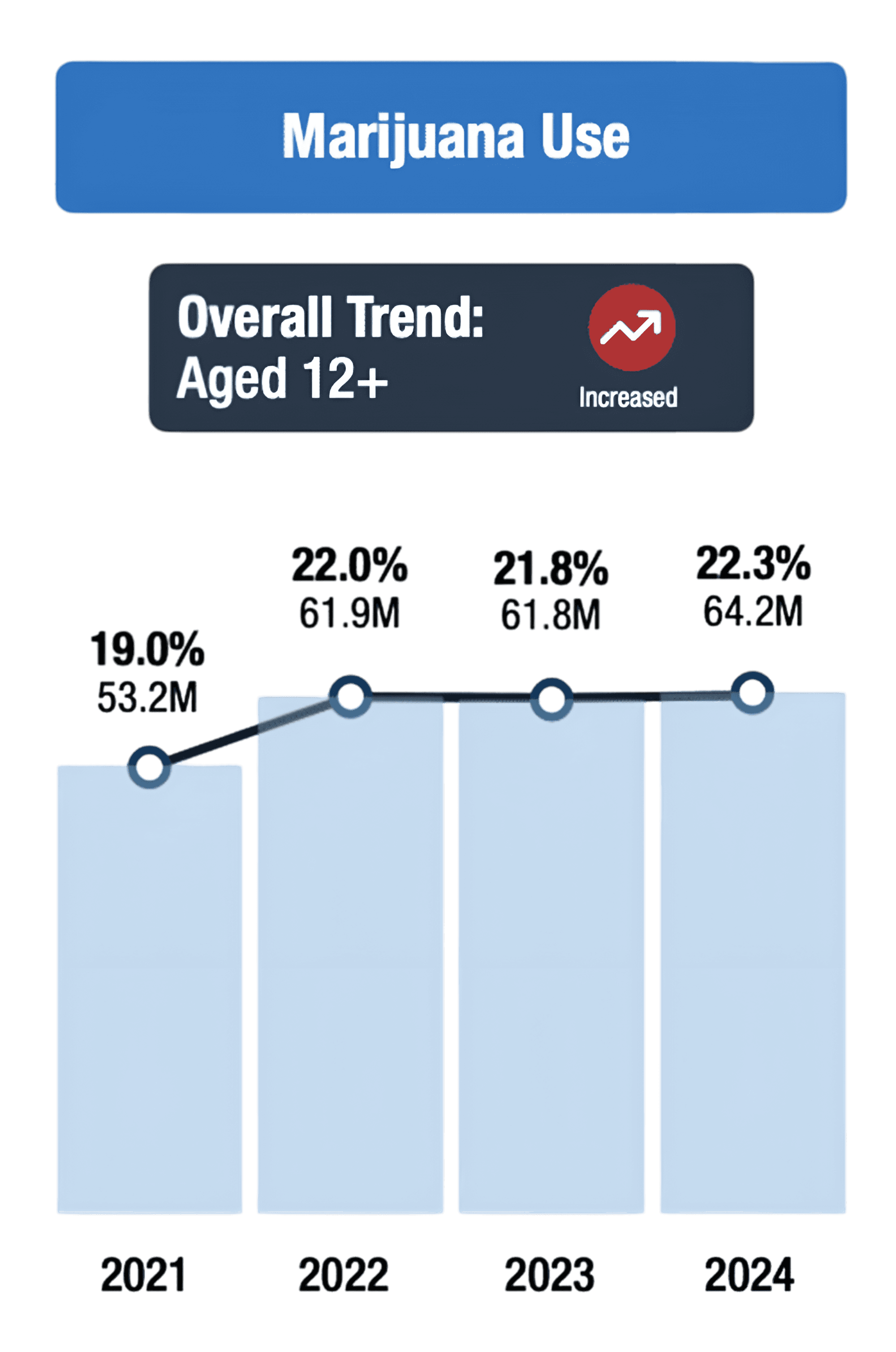
Marijuana use among people aged 12+ in the U.S. has increased from 19% in 2021 to 22.3% in 2024, meaning millions more teens and young adults are being exposed to cannabis.
Despite this rise, many teens still underestimate the risks of early marijuana use. At the same time, most existing resources fail to engage them, making it difficult for teens to access clear, relatable, and judgment-free information that truly supports informed choices.

The Project Goal
The goal of the project is to educate teens about the risks of early marijuana use and build awareness through engaging, easy-to-understand content.
The Solution
Making learning fun
We introduced interactive quiz modes and a modern, visually engaging interface so that learning feels fun, competitive, and motivating for teens.
Strengthening educational impact
Marijuana facts are presented through simple interactive elements and clear, relatable language, making the content easier for teens to understand and remember.
Encouraging continued engagement
Leaderboards, rewards, and easy social-sharing features encourage repeat visits, friendly competition, and help spread awareness among peers.
Research
Getting to know our users
I interviewed 5 teens aged 13–17 to understand their awareness and perceptions of marijuana use, and to learn how engaging formats like games and quizzes could motivate them to learn about this topic. These interviews helped me explore what makes digital learning fun and what keeps teens engaged. I asked them the following questions:
When you hear the word “marijuana,” what comes to mind — if anything?
If you had to learn about marijuana or health topics, what kind of app or activity (like games, quizzes, or videos) would make it easier or more interesting for you?
How would you describe your overall experience when using websites or apps for fun or learning?
What makes a website or app feel trustworthy and easy to use for you?
Can you tell me about any times you felt frustrated or confused while using a website or app?
What features or tools do you wish websites or apps had to make them more enjoyable or helpful?
What motivates you to use certain websites or apps over others?


🔑 Key user insights
Teens lose interest quickly when content is text-heavy or feels like a lecture, but they are more willing to engage with learning when it is interactive, playful, and feels like a challenge.
Many teens have limited or incomplete awareness about marijuana, so information needs to be delivered in a way that is simple, relatable, and free from judgment to build trust and curiosity.
Gamified elements — such as quizzes, scores, and friendly competition — make learning feel rewarding and motivate teens to return, explore more, and stay engaged longer.
Familiarizing myself with quiz-based
learning sites


I noticed that while these quizzes are fun and engaging, none of them meaningfully balance fun + serious health education — which highlighted a clear opportunity for this project.
Key takeaways from these Similar Quiz games :
One-question-at-a-time flow keeps momentum — users don’t feel stuck in long content.
Clean layouts + bold colors make the quiz feel lively — nothing distracts from answering.
Scores, streaks, and replay options really matter — teens enjoy improving their score rather than “being taught.”
Tone stays casual and approachable — the experience feels like a game, not a lecture.
Mood Board
A visual language for the brand style

Ideation

Turning Insights into Ideas
Based on the research findings and key user insights, we began brainstorming different ways to make learning about marijuana engaging, simple, and non-judgmental. We organized ideas, grouped themes, and explored multiple user flows in Figma to shape the foundation of the product.
Idea 1 — Teacher Dashboard
To support classrooms using a shared screen, we proposed a dedicated Teacher Dashboard with its own sign-in. This allows teachers to easily host quizzes, manage sessions, view live scores, and access past results — all from one simple interface.
In short, the Teacher Dashboard helps turn the quiz into a structured, classroom-ready learning activity rather than just an online game.
Idea 2 — Classroom Battle Mode
For classroom use, we introduced a Classroom Battle mode where the class is split into Team A vs Team B to compete in the quiz. This format makes learning more exciting and collaborative, encouraging discussion, friendly competition, and active participation while creating an energetic, game-like classroom experience.
Idea 3 — Time Boost Challenge
In the High-Score Challenge game, players answer as many questions as possible within a 20-second timer. To keep the game rewarding and motivating, we added a simple rule — every correct answer adds 5 extra seconds. This creates a fast-paced, continuous gameplay loop where players stay engaged longer, answer more questions, and naturally learn more as they play.
Idea 4 — Review & Learn Mode
After completing the quiz, users can open a View Answers screen where they can see which questions they got right or wrong, along with short explanations. This helps turn the quiz from just a scoring activity into a real learning experience, allowing users to understand mistakes, reflect, and improve over time.
Mapping the HIGHCOST Experience
How students, teachers, and game modes connect across the platform.

Let’s Keep the Screens on Testing
— We tested the prototype with 5 users to evaluate clarity, engagement, and learning impact. From these sessions, we uncovered three important usability issues that helped us refine and improve the experience.
3/5 users expected instant feedback to also show the correct answer so they could learn from mistakes.
2/5 users suggested adding power-ups (e.g., boost score or block the opponent) to make the 1-on-1 Battle mode feel more exciting and competitive.
In internal testing, the +5 second boost made High-Score mode feel too long and repetitive, so we reduced it to +2 seconds to keep the pace engaging.

Solving the Usability Issues
Visual Design
Website UI
Landing page

About page

Privacy policy

Facts page

Game UI Screens


